Thursday, October 26, 2017

Assignment 3


Introduction
                Dane County is interested in understanding the spatial pattern of the increase of home foreclosures in 2011 and 2012 as well knowing if the trend will continue through 2013. Addresses in the county have been geocoded into the various census tracts in Dane County so that an analysis can be conducted at the census tract level.

Methodology

                To complete my analysis, ArcMap was used display the census tracts for Dane County. Then a statistical analysis was completed using mean, standard deviation, z-scores and mean center. Standard deviation is the measure of the dispersion (how spread apart) a particular set of data and how the mean (average) accurately depicts the data. In this case, the mean was calculated by the average number of foreclosures per census tract. A z-score explains the position of a particular number and where in lands on the standard deviation curve (figure. 1) and can be used to find the probability of a particular occurrence taking place. For example, a negative z-score means that the likelihood of that observation is higher than 50 percent and if a z-score is positive than its probability is less than 50 percent. Also the larger the z-score the closer to the tails of the distribution the observation will be. Mean Center shows the spatial center of a set of data that can be weighted by statistics that can help display a specific spatial pattern in a data set. 
Figure. 1 Standard Deviation Curve 
Results
                When looking at the foreclosure data for Dane County (figure 2.) there was an increase in the number of foreclosures between 2011 and 2012 of 97 foreclosures for the county as a whole, with an increase of nearly an additional foreclosure per census tract on average. For this analysis three specific census tracts, 120.01, 108, and 25 (figure 3.). For each of aforementioned census tracts, their z-score were calculated to see how these different census tracts compared to the other census tracts in Dane County. When looking at z-scores for the 2012, a couple of patterns stick out. Census tract 120.01 has a very high z-score meaning that it has far more foreclosures than the county average and census tract 25 has a much smaller z-score and therefore falls to the bottom of the distribution. To place these results in the context of probability, for 2012 the number of 3.974 foreclosures will be surpassed about 80 percent of the time (z-score of -0.84) and a number of 24.962 foreclosures will only be surpassed 10 percent of the time (z-score of 1.28).
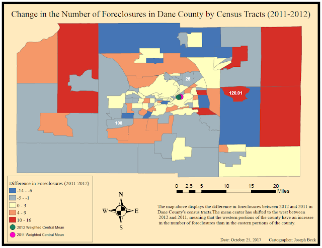
                When looking at the map for 2011 (figure 4.) there were fewer foreclosures in the center of the county with the largest number of foreclosures being found in the northern section of the county. In 2012 (figure 5.), the census tracts that surround census tract 120.01 had less foreclosures than in 2011. Looking at the differences between 2011 and 2012 (figure 6.) the most dramatic increases came about on the eastern and western borders of the county. Also, when looking at the Weighted Mean Center amongst the three maps below (figures 4,5, and 6),  it is evident that it has shifted towards the west and means that the spatial distribution of foreclosures has moved more so to the west.  Based upon the statistics provided (figures 2 and 3) and the maps below (figure 4,5 and 6) a trend of increased foreclosures especially the eastern and western borders were the greatest increase from 2011 and 2012 can be expected in 2013.
Figure 2. Shows the statistics for Dane County in 2011 and 2012
Figure 3. The chart above displays the statistics for census tracts 120.01, 108, and 25 for 2011 and 2012
Figure 4. The map above shows the number of foreclosures by census tract in 2011
Figure 5. The map above shows the number of foreclosures by census tract in 2012
Figure 6. The map above shows the difference in foreclosures between 2011 and 2012
Conclusion
                Based upon the information presented above, it can be inferred that an increase in the total number of foreclosures should continue. This is especially true for the census tracts located in the eastern and western sections of the county as the areas in the center of the county have been fairly stable in comparison. It is important to note that without further background information about the economic situation of Dane County, this study is fairly limited in the amount of information that can be interpreted. However there are important spatial trends that can be seen and that can aid county officials in their assessments of the foreclosure issue in Dane County going forward.

Sources
http://www.muelaner.com/wp-content/uploads/2013/07/Standard_deviation_diagram.png


Wednesday, October 11, 2017

Assignment 2

Part 1

Definitions
  • Range: is the difference between the highest and lowest values in a set of data
  • Mean: is the average of the data found from dividing the sum of a data set by the total number of observations
  • Mode: is the most common observation found in a  given data set
  • Kurtosis: is the how much a set of data falls along the tails of its statistical distribution 
  • Skewness: can be described as the tendency for a set of data to fall on either the positive or negative side of the mean for a given set of data
  • Standard Deviation: is a way of describing how dispersed a set of data is
Eau Claire North's teach staff has begun to question their teaching style when comparing their Standardized Test scores to Eau Claire Memorial's test scores. The concern stems from the fact that Eau Claire Memorial has always had the highest single test score. Both of the schools Standardized Test scores are shown below (Figure 1). A statistical analysis of the two school's scores below aims to bring clarity to the question of Eau Claire North's test scores not being as good as Eau Claire Memorial.
Figure 1. The tested sample of Standardized Test Scores for both high schools
Test Score Statistics
  • Eau Claire North
    • Standard Deviation: 23.635
    • Mean 160.923
    • Median: 164.5
    • Mode: 170
    • Kurtosis: -0.557
    • Skewness: -0.579
    • Range: 74
  • Eau Claire Memorial
    • Standard Deviation: 27.157
    • Mean: 158.539
    • Median: 159.5
    • Mode: 120
    • Kurtosis: -1.174
    • Skewness: -0.185
    • Range: 91
Analysis
Based upon the statistics shown above Eau Claire North's teachers should not be worried about their test scores. When comparing the two schools, Eau Claire North has a smaller standard deviation than that of Eau Claire Memorial meaning that Eau Claire North's test scores are more consistent and differ from the mean less than Eau Claire Memorial. Eau Claire North also has a higher overall test score mean than that of Eau Claire Memorial. Also, when looking at the two data sets kurtosis, Eau Claire North's test scores Kurtosis is smaller than Eau Claire Memorial meaning fewer scores fall at the ends of the distribution. As a whole, the teachers at Eau Claire North should not be concerned about their test scores compared to Eau Claire Memorial. Eau Claire Memorial does have the highest single test score but their scores are more variable and dispersed than those of Eau Claire North meaning the teaching methods being employed at Eau Claire North produce better scores as a whole when more statistical analysis is applied to their respective samples.


Figure 2. The figure above shows the calculations used to find the Standard Deviation of the two schools test scores

Part 2: Mean Centers
Mean Centers are the calculation of is average x and y values of a given data set
The Map below (Figure 3) shows three different mean centers calculated for the state of Wisconsin. They are the geographic mean center, weighted mean center the population in 2000 and the weighted mean center for population in 2015. When looking at the map below (Figure 3.) a few patterns standout. Many populations in the Northern Counties have experienced a decline in their populations since 2015. Counties in the Northeast and Southeast have seen their populations increase with the largest increase in Dane County (blue county located in southern Wisconsin). These shifts in populations may be caused by an increase in economic productivity in the northeast and southern regions of the state leading people from northern counties to begin to move southward. 

The Geographic mean center is the center of Wisconsin calculated by the average county area. The weighted means are the geographic mean only weighted by the total population in each county. The weighted mean center for 2015 shifted slightly southwest from its location in 2000. This is mainly caused by the increases in population in the southern counties of Wisconsin with the largest pull coming from Dane County located southwest of the 2000 weighted mean center. 
Figure 3. Map displaying the Wisconsin County population changes between 2000 and 2015 as well as the Geographic Mean Center and both Weighted Mean Centers for 2000 and 2015